
Digital and UX/UI
Scroll ↓
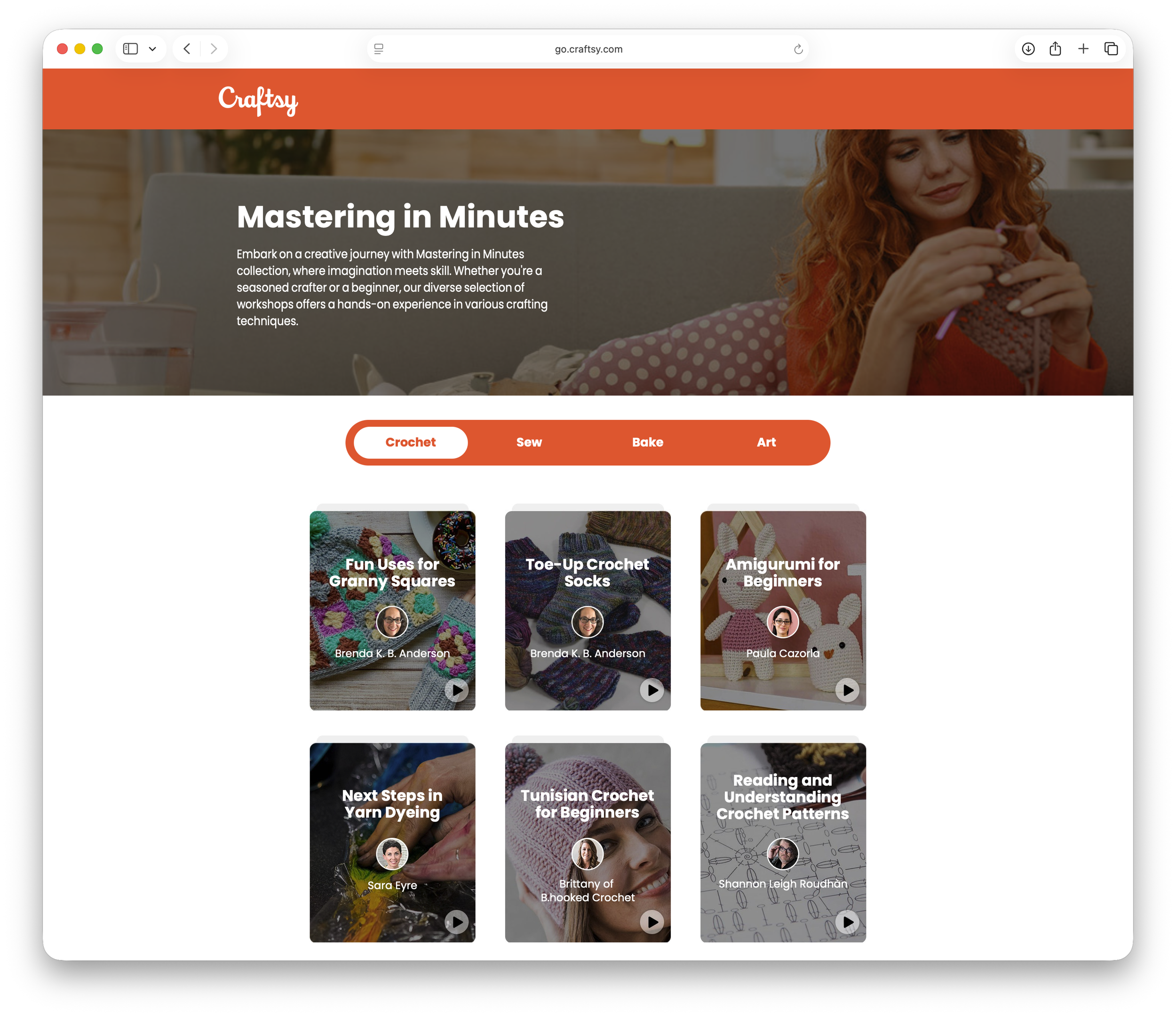
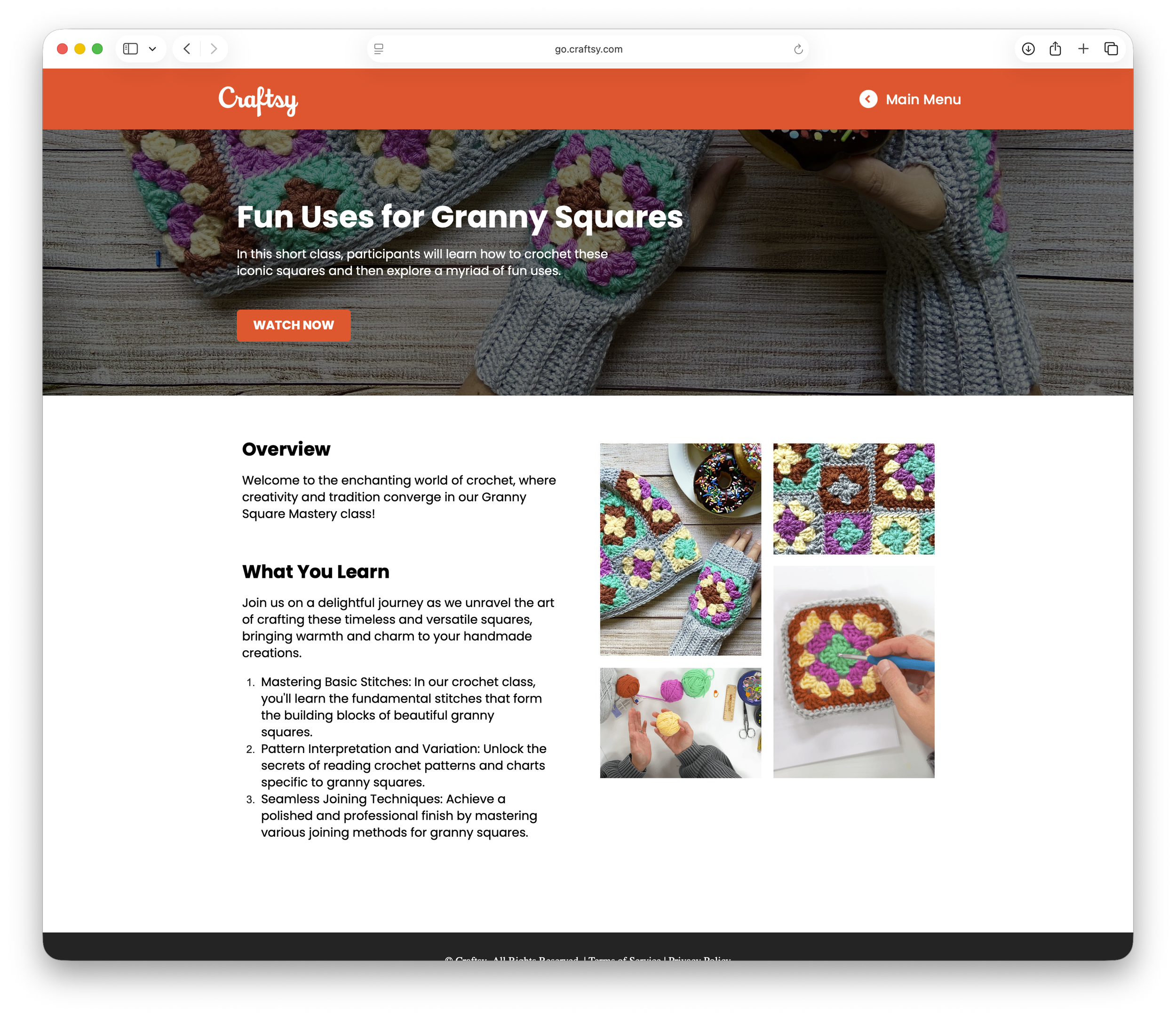
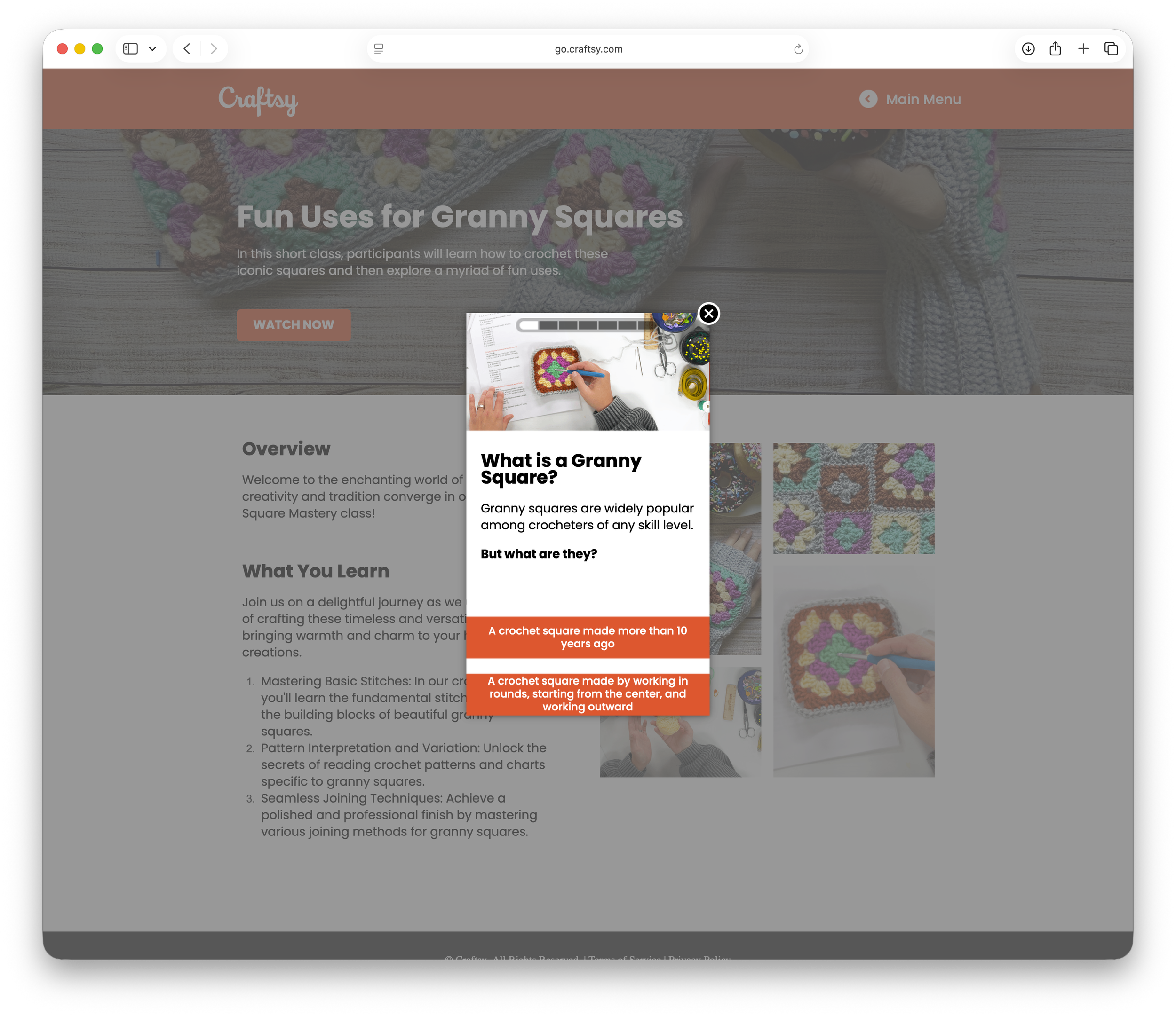
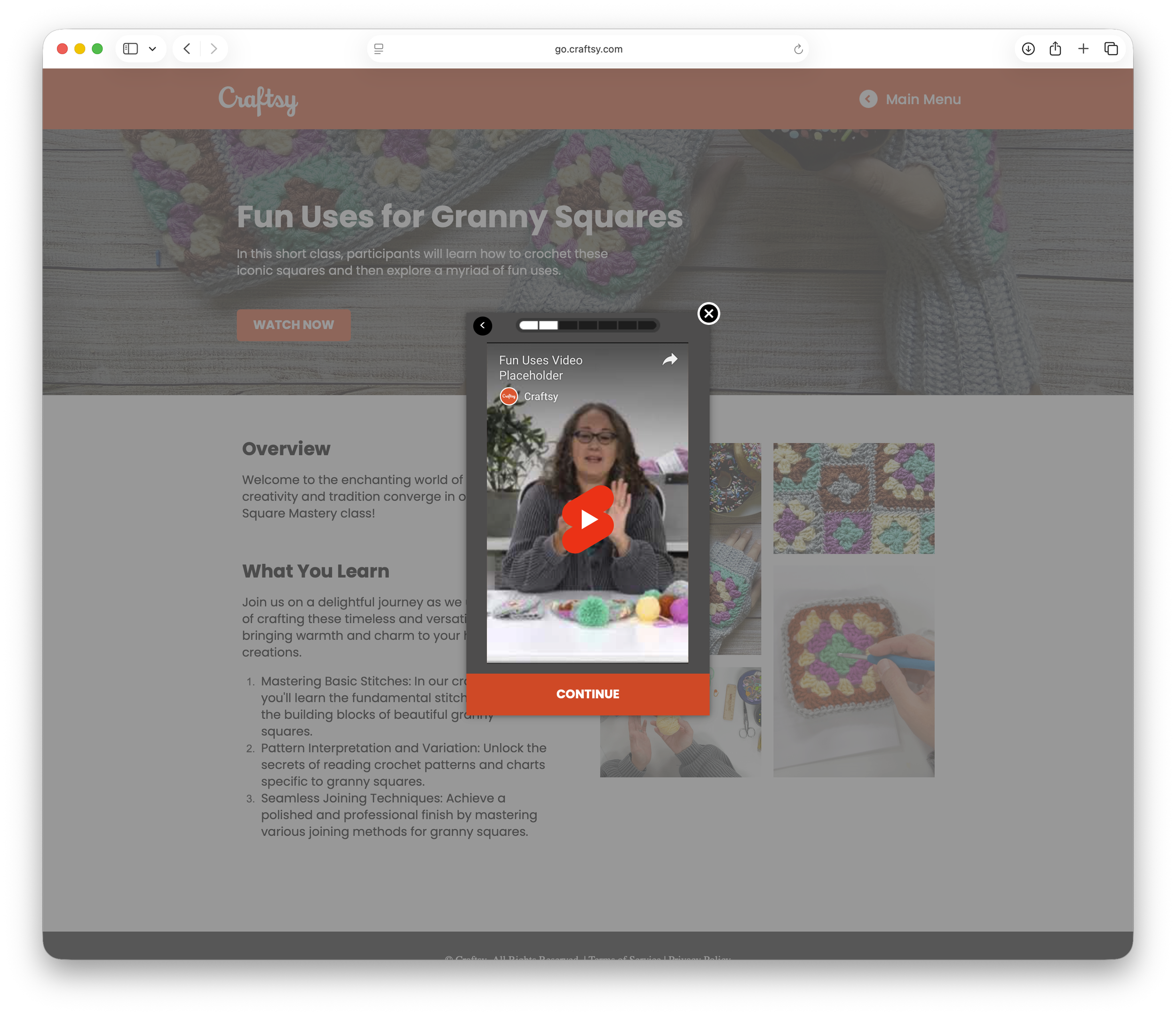
Mastering in Minutes:
A collection of long format crafting classes broken up into smaller, bite sized lessons intended to teach users the basics in minutes.
My Role: I led the complete creation of the website from concept through launch, overseeing the full UX, visual design, and site build. This included defining the user experience, designing layouts and visual elements, and translating the design into a fully functional, responsive site. Working end to end allowed for a cohesive experience across usability, design, and performance, ensuring the final product was intuitive, visually engaging, and aligned with project goals.
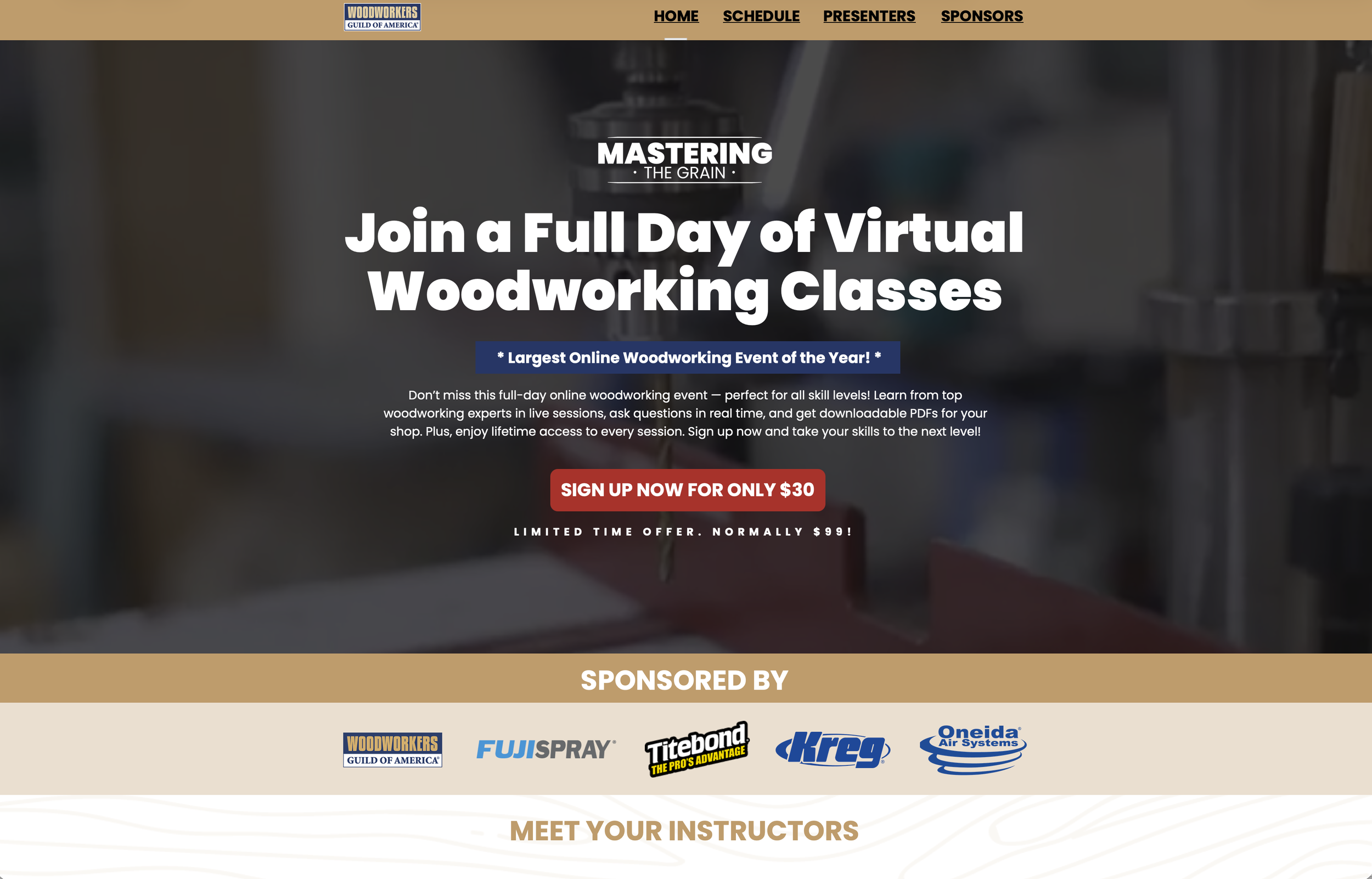
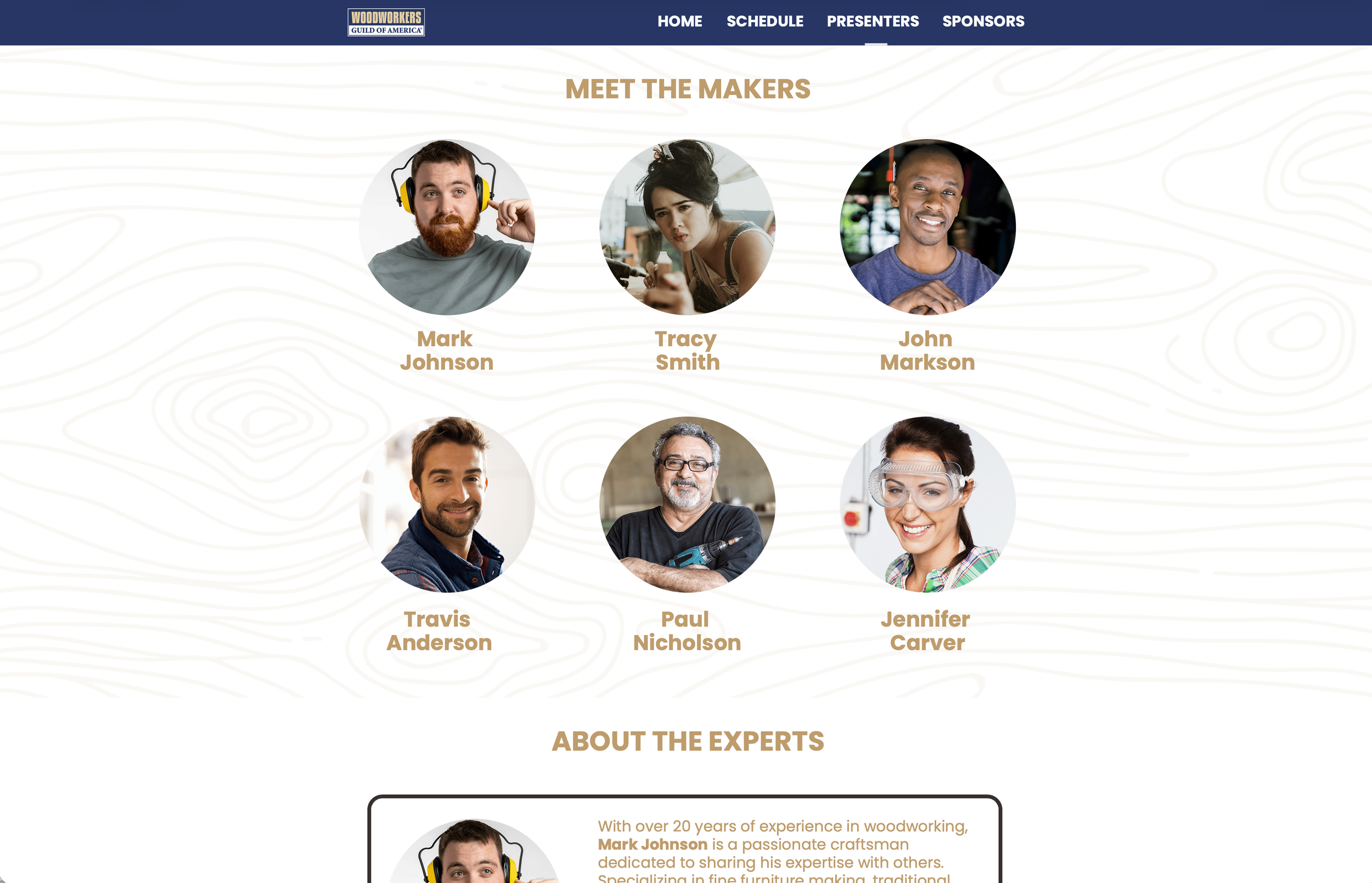
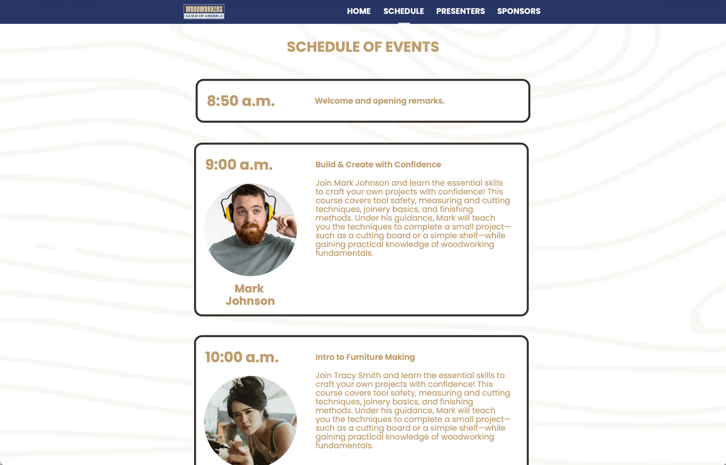
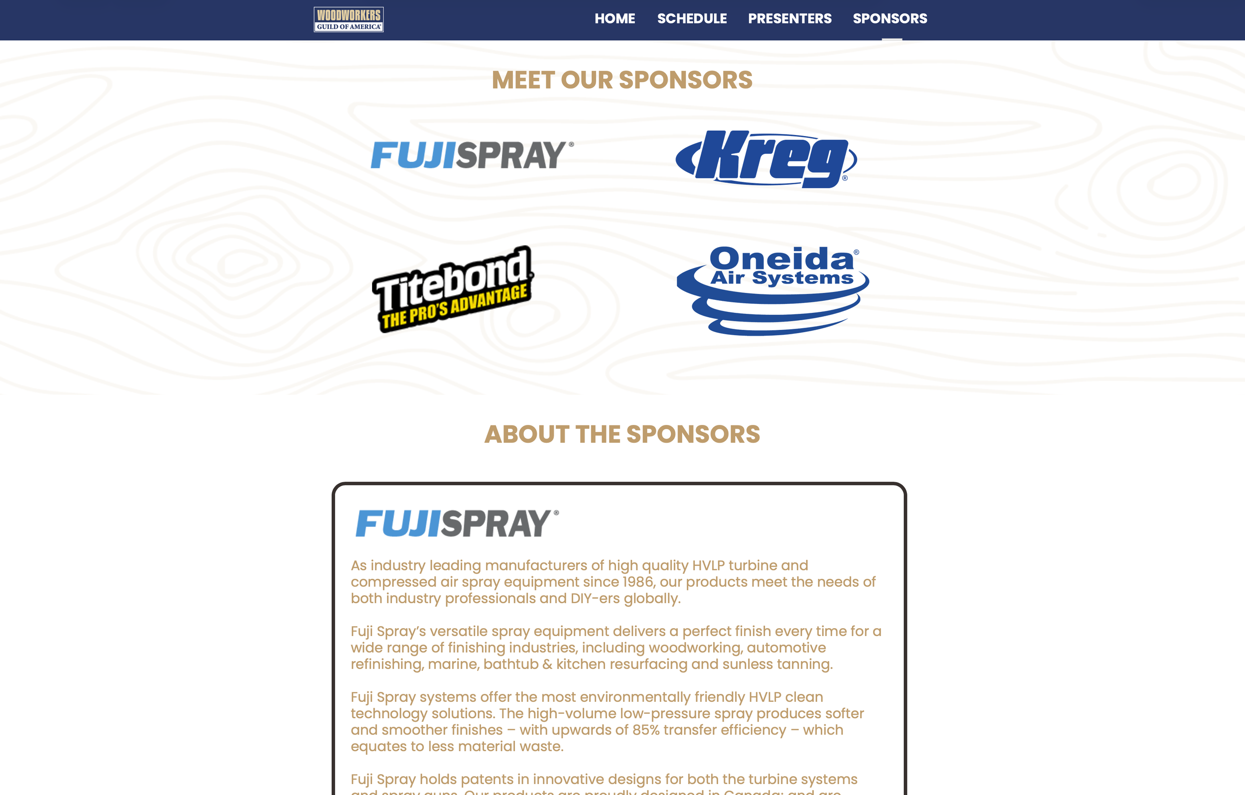
Mastering The Grain:
Website promoting an all day, virtual, woodworking training course.
My Role: The design and development of the informational website creating a clear, user-friendly experience that organizes schedules, presenter bios, sponsor information, registration details, and sign up link in an accessible and engaging way. My role included defining the site structure and user flow, designing the visual layout and interface, and building the site from start to finish. the result was a streamlined, easy-to-navigate website that helped users quickly find key information while supporting the goals for the class and its partners.
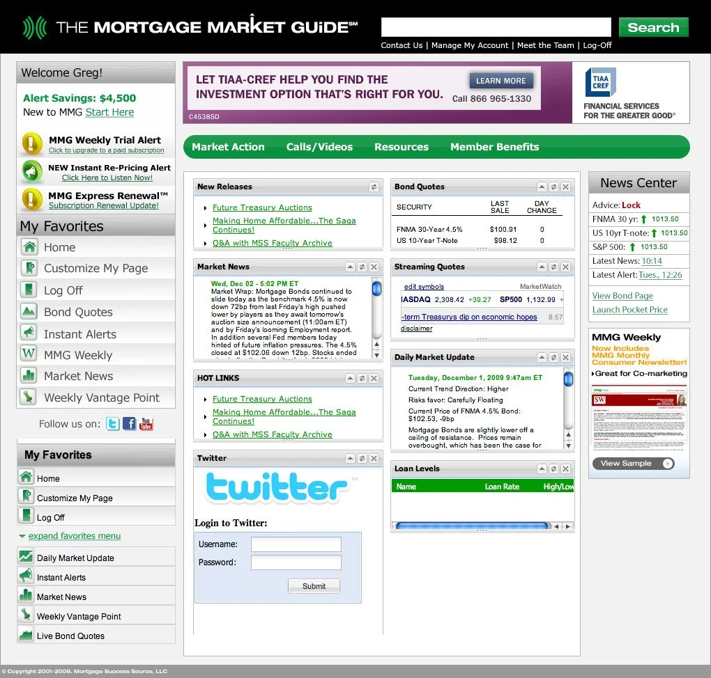
Mortgage Market Guide Members Site Redesign:
My Role: Lead UI/UX Designer
Scope: End-to-end redesign (user flows, wireframes, usability strategy)
The Challenge
The existing members site contained highly valuable, time-sensitive information—but users struggled to:
Quickly locate real-time bond quotes
Stay on top of mortgage repricing alerts
Efficiently consume housing market news
The experience was information-heavy, but not optimized for speed, clarity, or usability—which are critical in a fast-moving financial environment.
The Goal
Redesign the platform to make key information:
Immediately visible
Easier to access
Faster to understand
My Approach
1. User Flow Optimization
I mapped out how users interacted with the platform to identify friction points and inefficiencies. This helped uncover where critical information was being buried or overlooked.
2. Wireframing & Structure
I created wireframes that prioritized:
High-value, real-time data
Clear content hierarchy
Streamlined navigation
3. Usability-First Design Decisions
I focused on reducing home page clutter:
Grouping related information logically
Improving scanability of dense financial data
Elevating alerts and time-sensitive content
Key Design Improvements
Repositioned real-time bond quotes and alerts to be front-and-center
Simplified navigation to reduce the number of steps to key content
Improved visual hierarchy to guide user attention
Designed layouts that made complex data easier to digest at a glance
The Outcome
The redesigned experience allowed users to:
Access critical information faster
Make quicker, more informed decisions
Navigate the platform more intuitively
The platform evolved from a dense information hub into a streamlined, user-focused tool built around clarity and efficiency.

Old Mortgage Market Guide Members Portal
Redesigned Mortgage Market Guide Members Portal